Wednesday, December 28, 2011

The Solution!


What do you get when you take your client's new tag line, add the words that the tag line 
stands for and temper that with a desire for a concise, colorful and easy to use result? 
You get this functional, eye-catching icon for a new values roll-out program.


Monday, December 5, 2011

Make Them Want It!


Whether in print or online, grabbing attention with an eye-catching masthead
is a great first step towards increased readership.


The Same But Different


A fresh take on a recognizable icon.


Thursday, October 27, 2011

Brain Teaser


The client wanted a logo for their company as well as simplified versions for use as "app" icons.
Our little guy is just bursting with knowledge!


Friday, September 2, 2011

Protect Your Eyes ;-)


This poster makes use of bold design with minimal but effective color. 
The type for Helmet was designed from scratch with striking results leaving no doubt 
who the poster is for. As always, we try to do something that attracts attention 
and this photo illustration certainly does that.


These Rabbits Rock (and Fly)!


This poster is for a rockin' band with southwestern roots. We wanted to create an eye catching design 
with some unexpected elements. We also relied on great color and heavy type modification.
This one's worth clicking on for a larger view!


Wednesday, July 20, 2011

Just Clowning Around


Our Tara Vaughan gig poster is the second direct result of the "Alien" self-promotional series. 
In an entirely new style direction, this involves modified old engravings, type modification, 
photography and fun color use... including a very freaky looking little guy.


Grand New Design


This Satchel Grande gig poster is the first direct result of our "Alien" themed 
self-promotional posters (see below). We continue to show a wide range of design styles. 
We had lots of fun with type modification and use of strong imagery. 
All this was done in a super clean style.


Thursday, June 30, 2011

Resistance is Futile!


This is the third poster in our self promotional "alien series". 
Things are not looking so good for the earthlingz  ;-}  

Our alien posters have already helped us to secure some very fun work 
that we will be showing later on this blog. Stay tuned!


Thursday, June 9, 2011

Elmer Hits A Bad Note!


The second poster in our "alien" series depicts the results of not using our graphic design services. 
Don't be like Elmer and be sure to check back later to see our next "alien" poster.


Thursday, April 21, 2011

Attention Earthlingz!


This is a recent promotion the studio is doing to target the music industry both locally and nationally. 
It is the first of a series of promotional posters/flyers/cards.

We enjoy the artistic freedom and creativity associated with this sector of graphic design.

Contact New idea Design for any of your graphic design needs {or else}.


Tuesday, March 29, 2011

ROC Solid Design


Above are some design options for an orthopaedic center in western Nebraska. 
We were asked to feature a prominent area landmark in some designs. 
When designing logos and other graphic solutions, we explore many directions 
and color options. Happy clients are always the final desired result.


Wednesday, February 16, 2011

Raptor Wrappers

We were asked to design chocolate candy bar wrappers highlighting 
two resident raptors at the Alaska Raptor Center. 

Each bird is represented on milk chocolate and dark chocolate wrapper versions. 
The back side of the wrappers contain information about the specific bird and the center itself.


Tuesday, February 8, 2011

Funkadelic!


Silicon Bomb, a great funky band out of Omaha asked us to design 
a full CD package for them. Above is a preliminary rough design 
for the CD jewel case booklet. We were asked to use imagery of 
an exotic winged woman in a somewhat psychedelic art style.


Above is the final design of the three panel booklet showing 
4/color outside and 1/color inside with song lyrics.


Jewel case tray card with spines


2/color CD platter design


Friday, January 28, 2011

Size Matters


This logo was designed for a client who wanted us to use traditional 
imagery for the two main elements. Our job was to show that interior design 
skills are needed in the largest of homes to the most humble abode.

The challenge was how to "equally" show elements that are normally very 
different in size. The solution was to put some visual separation between the castle 
and cottage. This created foreground and background depth and a visual 
explanation for the basic sameness in the size of both.

An entire identity package was built around this logo. It was printed with metallic inks 
on a slightly wood flecked recycled paper that complemented the "aged" look.

Monday, January 24, 2011

Defining Moment


This poster was designed to define a client's new "catch word". The definition is in traditional text form
 and, for reinforcement, type was used as texture. Although we don't normally recommend stacking
 type vertically, with careful optical spacing on an angle it works well.

Wednesday, January 19, 2011

Read All About It


We really enjoy designing newsletters and believe a well designed newsletter creates interest and awareness. Above are two examples of covers for just one of many newsletters we have designed.

Tuesday, January 18, 2011

Eclipse...Totally!


This logo was designed to introduce a client's new program for entering system information. 
Precise character kerning and modification play an important part in the final look of this graphic.

Wednesday, January 5, 2011

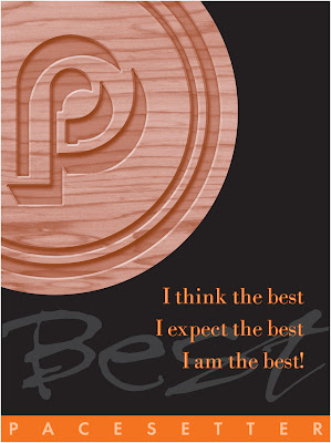
I am the best


A series of posters we designed for a client that specialized in residential renovation products.

This campaign focused on product and employee quality.

Visually, we were asked to show the company logo engraved in wood and stamped in metal. 
The last poster was just to be fun and loose.